 |
||||||||||||||||||||||||||||||||||||||||||||||||
|
Cloth - Thick Grain The second in the series of cloth tutorials I'll be writing talks about coarse weave fabrics. These are suitable for lower class people - again for example, rohan peasants. They'll also do well for warmish winter cloaks. I use a variation on the techniques outlined here for nearly every type of cloth that I make except for fine banners. The methods might not apply to elvish fabics, because they are so much more elegant and refined. Of course, I could simply argue that I've never actually drawn elf clothes before.... anyways. We're going to be working with the same Peasant texture from the first cloth tutorial-really continuing from where we left off. First, We can look at the parts of the skin that are constructed of cloth. Following the original layout, we have a 'skirt', the cloak, shirtsleeves and possibly the legs. Just to be safe, we'll do all three. First, open the document that was crated in the previous tutorial. You're going to want to make sure the other layers don't get in the way, so select the shirt, strap, buckle, belt and belt engravings layers. Group them via the layer menu (or press Ctrl-V). Name this group 'vest'.Create a new layer, name it 'skirt' or similar. In the layer panel, move it to below the 'vest' group. This way it'll say below the vest, and you can draw over the vest without any worries. On this layer, draw over the old, ugly bit of cloth on the texture. Rohirric clothes are a series of greys, greens and browns, so we'll use a greensih tinged medium brown. Brush should be of varying sizes so that you can best accomplish this. 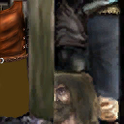 Once this is done, we can proceed to basic highlights and shadows, as usual. Shadow right below the intersection with belt and vest - I suggest a burn brush set on midtones at ~25%, using 0% hardness. This area shoud be exaggereated, as it defines where the vest ends and emphasizes the belt. You also want to use a burn brush to create a crase where the two sides of the skirt would intersect- in this case at the left edge of the skin. Use a stronger, ~80% hardness brush here. You'll want to make the gap a little larger at the bottom, tapering to near nothing at the belt. the centre of this crease should be almost, if not totally, black. 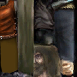 That's the general shadowing. Now, we must apply the general highlighting. This should be done with a dodge brush, a largish one with low hardness. Dodge lightly in the centres, the increase the exposure as you work outwards towards the edges. Again, this accentuates them greatly. Working in downward strokes will also help add to the effect, because cloth generally folds vertically if hanging like this. 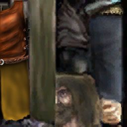 Now that the initial highlighting is done, we can apply the cloth texture. Go to filters -> Texture -> Texturizer. This basic filter applies a patterned texture to your selection- it is sometimes fine to use - other tiems it just looks odd. Folds in this bit of cloth are mostly minor, so it works here. Set the Scaling to 50%, Relief to 1, and play around with the light direction. For this, I'm going to use Top, but you can simulate other cloth styles by using different directions. Select OK. Do also note that the highlighting messed up the colour, so adjust with the Hue/Saturation controls, back to a browner colour.  Now that the texture is applied, we can add better highlights. First, using the dodge brush of size 5, go around the edges of the skirt again. 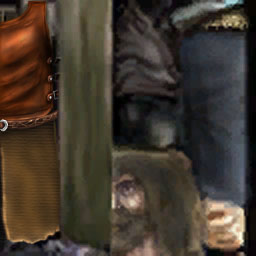 This adds a stiff edge to the cloth bit. Now take a dodge brush on highlights, size 13-19, hardness 0, an exposure of around 25% and begin drawing the highlights of fold lines into the cloth. These should be vertical - and are a completely subjective process. Do it until you're happy with it . Some tips - follow gravity, coordinate with 'bumps' on the bottom of the cloth bit, place the strongest highlights near the edges. folds can be more compressed near areas of compression - ie. around the belt. Correspondingly, use a burn brush on midtones set to roughly the same settings - perhaps a bit smaller - to darken areas around the fold lines you've created. this is just the inverse of the above step. After finishing, you may need to touch some areas up with the desaturate tool, the dodging and burning may have increased the saturation somewhat. 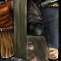 There! now, aside from some grunge addition, which will be done at the end, this stage is done. If you like, you can play around with additional dodging, the saturation, etc, but I like what I got here. So, create a new layer, name it 'cloak'. Simple, using a hard edged olive green brush, draw over the old cloak, being careful not to overlap on any of the new-drawn parts.  Then, once again, we add primary shadows. Use a burn brush , size 3, define the hood. For this you basically draw a black line with these settings. Then, use a larger, soft burn brush to further define this area. Using the same brush, draw a few lines downward to create a few cloak folds. This stage is just basic shadows, so do'nt worry about being precise. 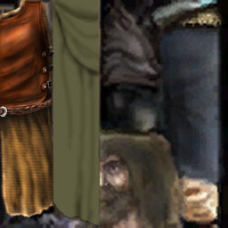 Similarly, add basic highlights. I suggest a dodge brush of size 9, on highlights. Exposure between 20 and 40%. For the larger areas, you may want to use up to size 19. Places to highlight- the bottom of the cloak, the lower edge of the hood. Otherwise, just mirror the shadows. 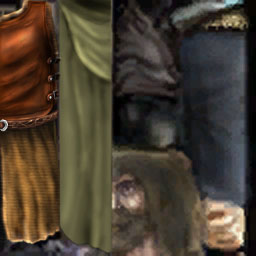 Then, we add a texture. I find a good way to add texture in the form of the rough wool used for a cloak to be adding a grain. So go to filter -> Noise -> add noise. I suggest a value of around 1.2%. This should give it a nice, but not too visible grain.  Next, detailed highlights ahve to be applied. Take a brush of size 5-13, with low hardness, and dodge (using highlights) to accentuate the folds you drew earlier. You can also add some new, finer folds, but be careful not to over-highlight anywhere except edges. Correspondingly, add shadows with a similar brush, but using burn (midtones).  That's probably the conclusion of the cloak. But wait! How is the cloak attached? Now we need to draw the cloak overtop of the chest armour, around the neck. So, create a new layer, with a name like 'neck cloak'. Using the same colour that was used as the base for the cloak, draw in the shape overtop of the leater vest (note: you may have to move the new layer to above the 'vest' group)  Simply use the same method as for the cloak to draw in a few fold lines, add noise, then accentuate them 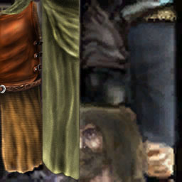 We must however also add shadows that this bit of cloth casts, so go and select the 'shirt' layer, and switch to a size 9 0% hard burn brush. Brush in a bit of shadow around the edges of the bit of cloak you drew  The other bit that must be completed is the sleeve. To that end, make a new layer, name it "sleeve". The current sleeve is both a) ugly and b) blue. We'll use a more "rohanninsh" colour, like the same brown that was used for the 'skirt' layer. So, take a painbrush and draw in the shape of the sleeve using a light brown  The next step is to add shading. For an arm you'll want to place some fold lines in specific places - where the arm will bend, for exanple. More folds would exist around the cuffs, and near the armpit. When in doubt, go grab a shirt, move your arm a bit and look how the folds behave. Draw based on those. So grab a bursh, size 5-13 or so, low hardness, and start burning. An exposure of 15% is good. You'll want to create a series of major folds that you can base later detail off of. I drew this set off of one of my own rainjackets. 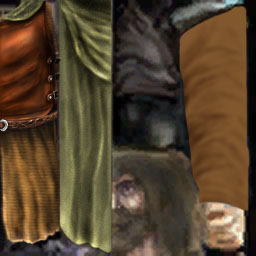 Then you're going to take a size 3 brush, slightly higer expose, and accentuate. You can also add some smaller fold lines. 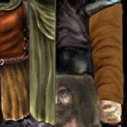 Then, switch to a dodge brush, low hardness, varying size, and create the highlights to oppose the shadows. 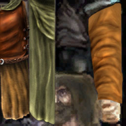 As is common with dodging on highlights, the saturation has been increased a bit too much, so take a sponge tool on desaturate to lower the saturation ununiformly. As well, you may want to apply some shadows at the top of the texture, to give the illusion that the cloak covers part of the sleeves, and some highlights on the cuffs, to give the impression that they are lifted abit, and loose. And here's what the texture looks at this point on the model!. 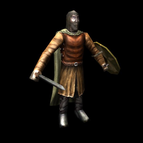 |
|||||||||||||||||||||||||||||||||||||||||||||||